A2 Media Coursework
Monday, 2 May 2016
Photoshoot
We held a session in which we got photos for our posters and double page spread's. Paige took the images up against Jacks green screen. The green screen made it much easier to edit the images on Photoshop.
Double page spread analysis
·
The main image takes up the whole of one page which is
conventional of a double page spread. This image is usually the first thing
seen by the audience and therefore must be eye catching. Spiderman is also
making direct eye contact with the reader which furthermore engages them into
reading the article. The image appears to be a screen shot from the film, this
is another conventional aspect to the main image; it allows the audience to
have an insight to what they will be watching.
·
The page contains a star rating which helps boost the
audience’s outlook on the film before they have even seen it. The audience can
be influenced a great deal by the star rating, as many would consider watching
it if it has proven to be a hit with other people.
·
The title of the film is the second most prominent
thing on the page which stands out as it is in thick black writing. The use of
the black text can relate to the narrative of the film, linking to the theme of
spiders. The page also has lots of red and blue, which are colours commonly
associated with Spiderman. It is much easier for the colours on the page to be
associated with the narrative as the audience are already familiar with the
film, due to it being the second one released.
·
The corner of the page has an enticing piece of text
saying “film of the month”. This draws the audience in as they are relying on
expert opinions. It also makes the film sound more certified and credible,
seeing as it has taken the top spot for the best film.
·
There is box of text which contains basic information
about the film such as running time etc. This is a common feature of a film
magazine as it just fills the audience with some basic knowledge. For those
members of the audience who are familiar with directors and so on, this may be
an enticing feature for them as they may choose a film to watch based on who
directed/ produced it.
·
A short synopsis of the film is included, which gives
the viewers an insight to the plot of the film. For people who are already fans
of the first film, this may not be as necessary, however it may work better at
enticing new fans if they like the sound of the story. This will eventually
result in gaining audience appeal, which brings in money in the box office.
· Other conventions of the page include things such as
the age rating, letting viewers know who its suited for/ the intended target
audience, page numbers located in the bottom corner, a drop capital in the text
allowing the audience to recognise where it starts and the name of the magazine
at the top of the page.
·
The colour scheme is very bright and vibrant which
suits the nature of the film. Action films stereotypically contains bright
colours as they have to work at getting the audience intrigued and interested.
The use of the bright red also connotes danger, which gives the audience some
indication as to what the film is going to be about.
Horror analysis
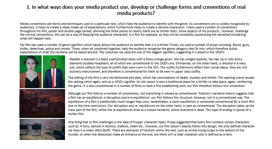
The main image on the poster is of a young girl looking into
a mirror; it is significant that the victim is a female, due to women being
commonly viewed as the weaker victims in horror films. The fact that she is
wearing minimal, clothing would suggest that she is vulnerable. The clothing is
also white, which has connotations of purity and innocence. The image is shot
in a bathroom, another conventional aspect of a horror film. The dark lighting,
setting and the costume of the young girl all suggests that it is night time- a
typical time of day for sinister activity to occur.
The young boy is making direct eye contact with the
audience, immediately making you feel on edge, due to him looking so creepy. It
also, for me in particular, plays upon the fear of walking into your own
bathroom at night with the worry of looking into the mirror in fear of seeing a
figure. This makes it something that the
audience can relate to, which intensifies the fear factor of the poster. He has
a very pale white face, suggesting he is ghostly and dangerous. The fact that
he is a young child adds to the conventionality of the film; young children are
commonly used in horror films as they are easily portrayed as eerie.
The poster has a blue theme which represents the coldness of
the room and unpleasant atmosphere. It contracts nicely with the reoccurring
white theme, representing the woman’s innocence, the young boy’s eeriness and
the coldness of the bathroom. The outside of the poster is a darker colour, which
is a conventional aspect of horror posters; it creates an uneasy feeling of
‘What else is out there?’ for the audience. There is also a great deal of
shadowing over the girl, giving the impression that she isn’t the only one in
the room. This again just reinforces the fear of the unknown into the audience.
The text in the left hand corner “Evil will do anything to
live” is ironic as it contrasts the idea of death and horror with the word
‘live’. This phrase gives the audience
an insight into the films storyline, suggesting that something evil will try to
take the life of something innocent. The phrase is also placed next to the
boy’s head, indicating that he is the ‘Evil’ that is being referred to. There
are white scratch marks around the wall, near the text, which act as genre
signifiers. It is common to see scratch marks up a bathroom wall in horror
film, usually being left by some sort of ghostly creature.
The movie title ‘The Unborn’ has a bright white outer glow.
The white light has connotations of heaven and passing life, suggesting that
some sort of death may be involved in the film.
The main character has a glow around the front of her too, indicating
that she may be the one who dies.
Both film posters carry the colour scheme of black and
white, which is a conventional aspect of horror posters. The black backgrounds
resemble the darkness and fear of the movie, and reinforce the fear of the
unknown into the audience. The colour black has conventions of death, which acts
as a genre signifier, allowing the audience to recognise that the genre is
horror. Both posters also have bright white central lighting; the second poster
has the same smoky/misty effect that we saw in the first poster I previously
analysed. It is a conventional aspect of horror posters and could symbolise the
presence of ghosts and demons. The third poster contains a bold bright light
coming from a window which creates suspicion, suggesting that something isn’t
quite right. Again, this white lighting can link to the presence of
spirits/ghostly figures. It also presents an opportunity to feature a shadowing
figure, which acts as a narrative enigma, as we are not sure why he is there.
The main image on the second poster is a medium close up of
a woman. Having the shot as a medium close up allows us to see emotion, helping
us to understand a bit more about her intentions/ the genre of the film. The
woman has a very pale complexion, immediately signifying that she is demonic;
she also has faint ghostly figures emerging from her body, again suggesting
that she has been taken over by something evil. The figures that are emerging
from her body have wide mouths, as though they are screaming, which almost
allows the audience to hear the screams, suggesting to them that it isn’t going
to be a pleasant film. The woman has deep bags under her eyes and various dark
marks on her skin which makes her look scarier, fitting into the horror genre.
Her clothes look old and worn in slightly, which is conventional look for possessed
character’s in horror films. She is making direct eye contact with the
audience, which pulls them in and sparks an interest; it also produces an
element of fear, especially as her eyes are white and lifeless, suggesting she
is an evil character. The difference of height in her shoulders suggest that
she is stiff and uncomfortable, which resembles the conventional body state of
someone in a horror film that has been possessed; this, to a certain extent,
makes the audience feel uncomfortable, as it suggests that she is a character
to fear. There are a number of white blurry lines going through the main image which
resemble the interference lines on a TV when there is poor signal. As the lines
are focused around the ghostly figures in the background, it could suggest that
they interfere with the woman/ real life.
The third poster has a scenic main image of a house and a
dark mysterious figure; the darkness that surrounds the street immediately
makes the audience think that there is going to be some kind of crime/ strange
happenings. The image is particularly scary as the audience is able to relate
to it to a certain extent: most people will live in a house and therefore would
be familiar with this sort of setting. We the begin to link ideas together such
as “what if this was my house?”, which makes the audience feel vulnerable and
allows the horror concept to be much scarier. The bright light in this image
again is a slight narrative enigma as we are unsure of why it is there. The
fact that all of the other windows are lit normally, however, one window beams
out onto the street, suggests that something sinister is happening in the room.
The light beam is directed at the figure, which reinforces the idea that he is
dangerous. The white light that can be seen on all 3 posters, again has
connotations of heaven/ ghosts, suggesting that perhaps a death is going to be
involved in the storyline. This poster contains genre signifiers such as: white
mist and shadowing, similar to the other two posters.
The main title on all posters are simple and located at the
bottom of the page, allowing them to not stand out too much. This is
conventional of a horror poster as it allows the main image, which a what draws
the audience in and contains most of the genre signifier, to stand out. Poster
2 has a white title, which has connotations of the afterlife, whilst poster 3
is in purple, which may be linked to horror as it is conventionally associated
with witches and gruesome things. The title ‘The exorcist’ is one of the
biggest indicators of genre, as most people know what an exorcism is; from this,
the audience are able to know that this is going to be a horror film. ‘The
Atticus Institute’ on the other hand, doesn’t give too much away about the
genre, and therefore has a short description of the film “The only case of
demonic possession recognised by the U.S government”. This small description
allows the audience to understand much more about the film as the words
‘demonic possession’ link clearly to the horror genre. The noun “government”
also makes the film sound more official and certified, enabling people to
actually believe that it is a true story, which again makes it that extra bit
scarier. The text of this description is in a very formal font, again making it
look that bit more certified. On poster 2, it features a small piece of text
which lets the audience know that it was from the makers of the conjuring: this
will entice a larger amount of people into watching the film, as the conjuring
is an established horror film, that proved to be popular. Poster 3 also has
text that draws the audience in such as: “The scariest movie of all time” and
“A version you’ve never seen”. This is simply anchor text and contains buzz
words that persuade the audience into watching the film. The phrase ‘A version
you’ve never seen’ is underlined, which just reinforces the message of “Go and
watch our film”. It is common to have
short phrases that particularly aim at enticing the audience, seeing as the
main goal is to produce as much money as possible at the box office.
Romcom analysis
The main image on the poster is of a male and female couple,
which are traditionally the type featured in Romcoms; this immediately allows
the audience to recognise that the film is going to follow the conventional
storyline of two people in love. The black line in the middle of the page
divides the male and female, which metaphorically suggests that they have
barriers between them. This suggestion allows the audience to assume that the
film will follow a storyline in which once character will overcome barriers to
be with the other character.
The female is wearing a glamorous red dress which has
connotations of love and passion. Red is the predominant colour associated with
love, which acts as a genre signifier, allowing the audience to understand more
about the film. The male is directing his eye line towards the female and has a
look of admiration on his face, suggesting that he desires. The female is
making direct eye contact with the audience, however, has a playful smile which
suggest that she is aware that the man is after her. Both characters are leaning in to each other
which represents their mutual attraction.
The biggest genre signifier on the page is the two red love
hearts. Both characters are holding a heart each, which represents their love
for each other. The male is holding his heart down in his private areas, which
summarises the stereotype that all men are after sex. This again reinforces the
idea that the man is into the woman.
The colour scheme of the poster is white and red: red is a
stereotypical colour of love, and commonly associated with passion, where as
white represents innocence. This could therefore suggest that the film will be
a mixture of an innocent character falling in love. The background is plain
white, which allows the focus to be kept on the couple and the relationship
between them, which is what the film is about. Red also appears predominantly
around the male and female, which again simply reinforces the fact that the
film is about two people in love.
The actors names at the top of the page acts as audience
appeal, drawing them in. The actors are also associated with films such as: 27
dresses and P.S I love you; this would therefore entice the audience into watching
the film if they have a previous liking for romcoms/ romances. The boldness of
the surnames allows them to be noticed easily, which is evidently one of the
main things that draws the audience in.
The font of the title ‘The ugly truth’ is in a simple thin
font, suggesting that the film is light hearted and not too serious. The
boldness of the word ‘ugly’ highlights it, indicating that there will be some
form of hurdle/ something bad that will happen in the relationship.
The main image is of a woman and a man, which again, is the
stereotypical couple that are featured in a romcom, however, poster takes a
less traditional view on the concept of proposing as it features the woman
holding the ring. This automatically entices the audience as the conventions
are flipped which leaves you questioning what the film is about. The male’s
facial expression suggests that is he scared/apprehensive which, again, isn’t
an emotion that we associate with marriage and proposal. The position of his
body also suggests that perhaps he isn’t 100% agreeing to the marriage, due to
the fact that he is leaning away from her, as though he is trying to escape.
Both characters are making direct address with the audience,
which works well at enticing us in. The female has a smug/ mysterious look on
her face, which indicates that she is up to something. The unconventional
emotions that are associated with the characters in the main image leaves the
audience wanting to watch the film in order to find out what the storyline is.
Both characters are in formal clothing which suggest that
this may revolve around an office type relationship. An office relationship is
a conventional component of a romcom: it is used as a typical place for two characters
to meet/fall in love. On another level, the formalness of the clothing could
symbolise how their relationship is unnatural. The female, nevertheless, looks
glamorous, which is another convention of a romcom.
The colour scheme of the poster is again, red and white,
which appears to be a convention with romcoms. Just like the first poster, the
red has connotations of love and passion, whilst the white suggests innocence
and purity. The white background also allows the audience to focus on the
couple, whom again, are the most important things.
One of the biggest genre signifiers on the page is the
wedding ring; this automatically indicates to the audience that the film is
going to contain a form of romance, due to it being a symbol that everyone is
aware of. This therefore begins to build expectations in the audience’s mind of
some of the themes that will occur in the film.
The main title is in a more visible place than the previous
poster, due to the name itself being a genre signifier; the noun ‘proposal’
connotes weddings and love. The fact that it is in a large red font makes it
one of the first things that the audience notices. The colour of the font again
suggests romance.
There is a short tag line which gives you an insight as to
what the film is going to be about “Here comes the bribe”. This is a play on
words and mocks the traditional ‘here comes the bride’ saying which adds an
element of comedy. The noun ‘bribe’ also allows the reader to make links with
the characters facial expressions, suggesting that she is persuading the man
into marrying her.
Lastly, the actors names are featured at the top of the
page, which entices the audience, due to the fact that they are established
actors. The font of their names is very simple and thin, similar to the
previous poster, which again indicates that it is going to be a film not to be
taken too seriously. The surnames are in red, once again connoting love and
romance. The fact that both surnames are red can indicate that there is some
form of loving relationship between the two.
Subscribe to:
Posts (Atom)